How colors affect the behavior and mood of people, what is the meaning of colors in psychology, and how to apply this knowledge to business development – read below.

What Is the Psychology of Color?
Contents
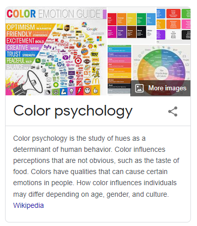
Color psychology examines our response to different colors. Its task is to understand how and why people change their moods and behavior depending on a particular shade. Designers and artists have put the science of color at their service and brand managers, marketers, car manufacturers, and many others.
Suppose you go to bed. With which wall color will you feel more relaxed and calm – beige or purple? In the world of hyperlinks and CTAs, which button would you rather hit red or green? Does color play a role in the choice of clothing?
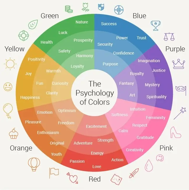
Color is a subjective thing. A certain shade can cause opposite emotions in people, depending on personal preferences, upbringing, nationality, and even religion. For example, we often classify red, orange, and yellow as warm, “sunny” colors, while green, purple and blue are considered calm and refreshing.

The Psychology of Color in Marketing
Because colors have a powerful effect on our emotions, they can be intelligently used in marketing to convey a specific message to an audience and shape a brand’s perception. The correct color scheme is essential for creating the brand identity and corporate style. It sets the tone and enhances the individuality of the company. This is true for all of a company’s marketing assets, from logo and website designs to handouts, flyers, and other media.
To select suitable colors, you can use the color palette generator to select matching shades. However, without understanding the psychology of color and which colors evoke certain emotions, it will be difficult to make the right choice.
Let’s imagine a brand of ice cream. Intuitively, you understand that its color scheme, whether the interior of a store, a showcase, a website, even glasses, will be bright or pastel, encouraging you to smile and relax. At the same time, the choice of a dark palette also takes place – for example, if it is a premium ice cream brand, where black traditionally personifies expensive premium goods.
Another example is a yoga instructor’s website. What shades come to mind first? Typical color schemes for such a business include light and neutral shades such as beige, white, light gray, and pale pink. The harsh combination of black and red is unlikely to create the tranquility and Zen atmosphere of savasana meditation.
The Meaning of Colors
Although each individual perceives color differently, there are still some emotional and psychological impact patterns. Color by 62–90% determines how the buyer will treat the product. We will tell you what and where to use it.
Blue meaning
The most versatile color that suits almost everyone. Blue has many shades, from turquoise to indigo, and each of them can be perceived differently. This color is often used in logos of large companies and corporations, making its connection with business very strong. Recall, for example, the logos of international Facebook, LinkedIn, Twitter, and Russian Mail.Ru, Norilsk Nickel, Gazprom, and others.
Blue is a symbol of stability, calmness, reliability, and purity. It is associated with a sense of serenity, harmony, and tranquility, reminiscent of the sea and sky.
How does blue affect a person? It affects emotions: balances, controls, soothes.
Fact: Blue also has a downside, sad side – sometimes it is associated with feelings of depression. Throughout art history, various artists have used it, most notably by Picasso, to express dark and negative sentiments in their work.
Green value
Green is the color of nature, life, and freshness. It is often used as a symbol for ecology and sustainability in color psychology, which makes it popular with food brands. In addition, green is associated with money and is suitable for finance.
For example, Spotify’s use of a vibrant shade of green suggests that the company is full of drive and vitality.
Supermarket chain VkusVill also uses this color, choosing a darker shade that creates the feeling of foliage and tree crowns, thus showing that their products are natural, organic, and healthy.
Sberger, who recently updated his logo, chose green during the reign of the tsar in 1841. Symbolizing money, wallet, and coin has hardly changed in 180 years. Only shades of green have improved over time.
Black value
Black has many different meanings. On the one hand, this is a timeless classic. It is associated with austerity, elegance, sophistication, wealth, strength, and mystery. At the same time, black is associated with anger, loneliness, envy, and mourning. It is noteworthy that black has a mourning connotation in Western culture, while it is the color of joy in Japan.
The blackest black in the world is not oil, but Vantablack – a color that made a splash in the art world, and sculptor Anish Kapoor acquired exclusive rights. Vantablack is so dark that it absorbs 99.96% of the light.
Black is actively used by brands in beauty, art, and clothing in marketing. MAC cosmetics, Gucci fashion house, Adidas sporting goods, and Lexus cars – their logos were executed in black. This way, they emphasize quality, premium quality, and style.
White value
White represents innocence, purity, and virtue. It symbolizes a blank white canvas or, in other words, a new beginning. It is a neutral color that rests the eyes, so it is widely used in all business areas, from interior design to web design (for example, a lot of white space air around this blog post).
In addition, the white color gives a sense of pristineness and hygiene. Therefore, it is so often used in the medical field and cosmetology.
White is a very neutral color, so it is always complemented with another shade, the contrast of which determines the mood and atmosphere of the resulting palette.
Let’s get back to the “conflict” of cultures – not only does black have different meanings in the eastern and western hemispheres, white, in turn, but it also means death in East Asia. There, white robes are worn during mourning, which symbolizes rebirth and purity.
Yellow value
Warm, energetic, inviting – yellow is great for attracting attention. The yellow color is instantly registered and processed by the brain, stimulating its functioning and the nervous system. That is why it is used for warning signs, reflective vests, and emergency vehicles. In nature, it is used for the same purposes – the wasp warns of danger with its yellow-black body and the poisonous frog with yellow stripes.
However, yellow symbolizes caution and is also associated with optimism, sunshine, and warmth. Positive associations with yellow are prevalent worldwide and in many different cultures. This universal perception explains the choice of yellow for emoji.
Let us recall the CTC logo, which is a “classic entertainment channel.” Bright yellow letters and the corporate style of the screensaver design ambiguously hints that there will be no horror films, sad news, and criminal chronicles here.
In 2018, a certain shade of yellow became popular. Dubbed “Gen Z Yellow.” Pantone has identified it in its palette as a fresh, contemporary color popular in fashion design and music videos, graphic design, and arts and crafts.
Plus, the color yellow resembles gold, which is why luxury brands love it. For example, one of the most famous brands of sparkling wines, Veuve Clicquot, uses a bright yellow tint in combination with golden on the company labels. Many jewelry brands also use this tone, reminiscent of the glitter of gold and sun glare.
Red value
A vibrant color that calls for action. It is associated with passion, love, and seduction, but at the same time, it creates an atmosphere of danger, anger, violence, and war.
Red attracts attention, excites the nervous system, and brings you out of a calm state. That is why it is used for warning road signs and fire engines.
Red is perceived differently in different cultures. For example, in China’s stock markets, it denotes a rise in prices, while in other countries, it has the exact opposite meaning. Why is that? Answer: Red is a lucky color in Chinese culture. It is also used for bridesmaid wedding dresses and symbolizes celebration and fertility.
Pink value
It is no longer possible to say with complete certainty that pink is the color of women’s brands, although it was just ten years ago. The stereotype is gradually disappearing, and it is being replaced by more and more companies that use this color in marketing.
In color psychology, pink is often associated with playfulness, fun, and lightheartedness. He personifies freshness, youth, and striving forward. Bright shades of pink, such as magenta or fuchsia, stand out, but they are less disturbing or dangerous than red.
Perhaps the most famous brand to use pink in their signature style is Barbie. Other women-focused companies opt for pinks, such as Benefit and Victoria’s Secret.
But notice how often pink has started to appear in the branding of IT companies. Think of the hot pink Invision logo. This same shade is used throughout the brand’s visual communication. Insurance startup Lemonade is not far behind, where pink is the leitmotif through its website design, illustrations, and logo.
Purple color meaning
Purple symbolizes luxury, royalty, nobility, and wisdom. In antiquity, purple was worth its weight in gold due to its high cost and dye shortage, which made it an attribute of royalty and imperial dignity.
Purple is a rather unusual color for marketing and is rarely used in branding in large companies. One of the few examples is the Cadbury factory, which has used its logo since the early 20th century.


[…] of the first steps in deciding what to wear for family pictures is selecting a color palette. A well-thought-out palette can create a cohesive look, tying everyone together without […]
[…] is an art form that allows you to capture the natural beauty of wood, showcasing its texture, color, and craftsmanship in stunning images. By using the right lighting, composition, camera settings, […]
[…] you are a photographer, graphic designer, or e-commerce business owner, achieving the perfect color balance in your images is crucial for making them visually appealing. The right color adjustments […]