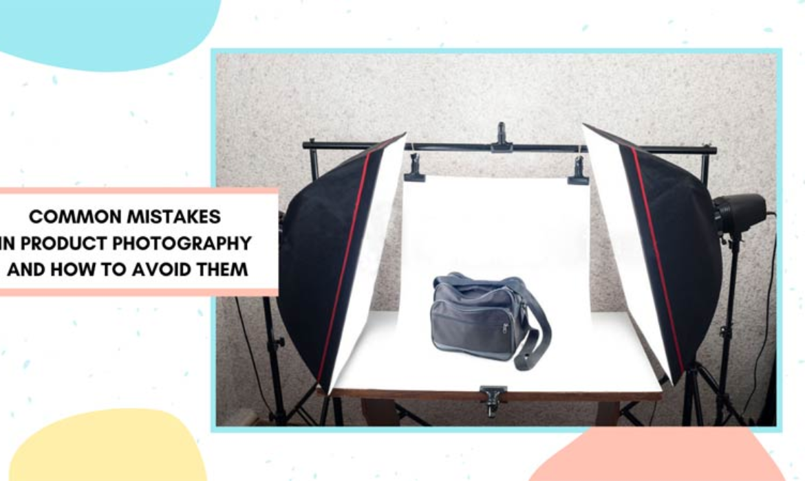
In the competitive world of e-commerce, captivating product photography is a non-negotiable element for attracting customers. However, even with the best intentions, many sellers fall prey to common mistakes that can adversely affect the visual appeal of their products. In this guide, we’ll explore these pitfalls and provide insights on how to avoid them, ensuring your product images shine and leave a lasting impression.
Introduction
Contents
Product photography is a powerful tool for showcasing your merchandise, but small mistakes can have significant consequences. From poor lighting choices to subpar composition, these errors can deter potential customers. Let’s delve into the most common mistakes in product photography and discover how to sidestep them to create compelling images that drive sales.
1. Insufficient Lighting
The Mistake:
Insufficient or improper lighting can result in dull, unappealing product images. Shadows and uneven lighting can obscure important details, making your products less enticing.
How to Avoid It:
Invest in good lighting equipment, such as softbox lights or ring lights, to achieve even and consistent illumination. Utilize natural light whenever possible, but be mindful of harsh shadows. Experiment with different angles to find the best lighting setup for your specific products.
2. Inconsistent Backgrounds
The Mistake:
Inconsistent or cluttered backgrounds can distract from the focal point – your product. Mismatched backgrounds across your product catalog can create visual dissonance and diminish the overall professionalism of your store.
How to Avoid It:
Maintain a consistent background throughout your product images. Whether it’s a plain backdrop, lifestyle setting, or transparent background, uniformity contributes to a cohesive and polished look. Use background removal tools or choose a consistent setting for your photoshoots.
3. Blurry or Out-of-Focus Images
The Mistake:
Blurry or out-of-focus images convey a lack of attention to detail and professionalism. Customers rely on clear visuals to assess product details, and a blurry image can lead to uncertainty and hesitation in making a purchase.
How to Avoid It:
Ensure your camera is steady and use a tripod for stability. If capturing movement, consider using a faster shutter speed or appropriate mode on your camera. Take multiple shots to increase the chances of obtaining a sharp image, especially when dealing with small or intricate products.
4. Overlooking Composition Principles
The Mistake:
Neglecting basic composition principles can result in unbalanced and unappealing product images. Poor framing, awkward angles, and cluttered compositions can detract from the product’s features.
How to Avoid It:
Adhere to composition basics like the rule of thirds. Position your product strategically within the frame, avoiding distracting elements. Experiment with different angles and perspectives to find the most visually appealing composition for your specific products.
5. Ignoring Product Details
The Mistake:
Failing to highlight important product details can leave customers with unanswered questions. A lack of close-up shots or images focusing on key features can hinder customers’ ability to make informed decisions.
How to Avoid It:
Capture a variety of shots, including close-ups that showcase intricate details. Highlight unique features, textures, or craftsmanship to provide a comprehensive view of your product. Don’t assume customers will overlook minor details; they often make a difference in purchasing decisions.
6. Inconsistent Image Sizes and Quality
The Mistake:
Displaying product images with varying sizes and resolutions can create a disjointed and unprofessional appearance on your website. Inconsistencies in image quality may also give the impression of inconsistency in product quality.
How to Avoid It:
Standardize image sizes across your product catalog for a polished and organized layout. Invest time in proper image editing to maintain consistent quality. Ensure images are optimized for web use to improve website loading times.
Conclusion
Avoiding these common mistakes in product photography is essential for presenting your products in the best possible light. Consistent, high-quality images build trust with customers and enhance their online shopping experience. Take the time to invest in proper equipment, adhere to composition principles, and showcase your products with clarity and detail. By sidestepping these pitfalls, you’ll create a visually appealing online store that attracts and retains customers.
Ready to elevate your product photography game? Implement these tips today and watch your product images transform into powerful assets for your e-commerce success.
FAQs
Do I need expensive lighting equipment for product photography?
While professional lighting equipment can enhance your setup, natural light and budget-friendly options like softbox lights can also yield excellent results.
Can I use the same background for all my product images?
Yes, maintaining a consistent background across your product catalog contributes to a cohesive and professional look.
How can I ensure my product images are always in focus?
Use a tripod for stability, ensure proper camera settings, and take multiple shots to increase the likelihood of obtaining sharp images.
Should I include close-up shots of every product?
It’s advisable to include close-up shots for products with intricate details or unique features. This helps customers make informed purchasing decisions.
Is image editing necessary for all product photos?
Image editing is crucial for maintaining consistency and presenting your products in the best light. Standardize image sizes and optimize for quality to enhance the overall appearance of your online store.


[…] hiking with photography gear, it’s crucial to have a specialized backpack. A good camera backpack for hiking does more […]
[…] correction isn’t just a fancy add-on—it’s a must-have for anyone serious about photography. When you snap a picture, things like bad lighting, camera settings, or even the weather can mess […]